
Stardog Documentation System
Enterprise software
UX Research
B2C
Restructured Stardog’s documentation around how users actually work replacing product-first organization with clear, task-based pathways.
Role
Product Designer
Timeline
10 months
Tools
Figma
Slack
Team
1 PM & Researcher
2 Leads
1 Engineer
4 Designers
Contributions
Research
User interviews
Survey co-design
Usability testing
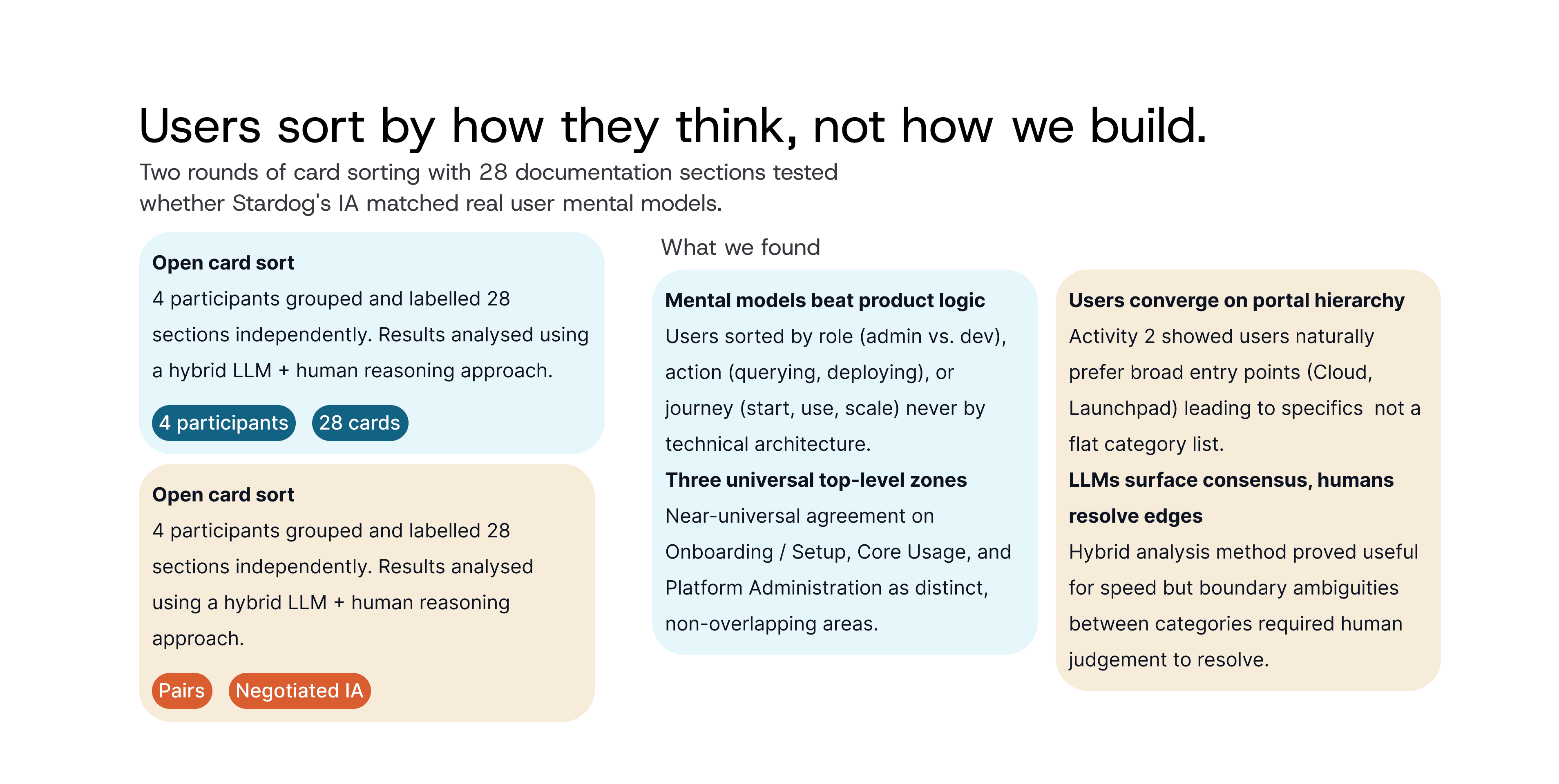
Card sorting
Analysis
IA audit
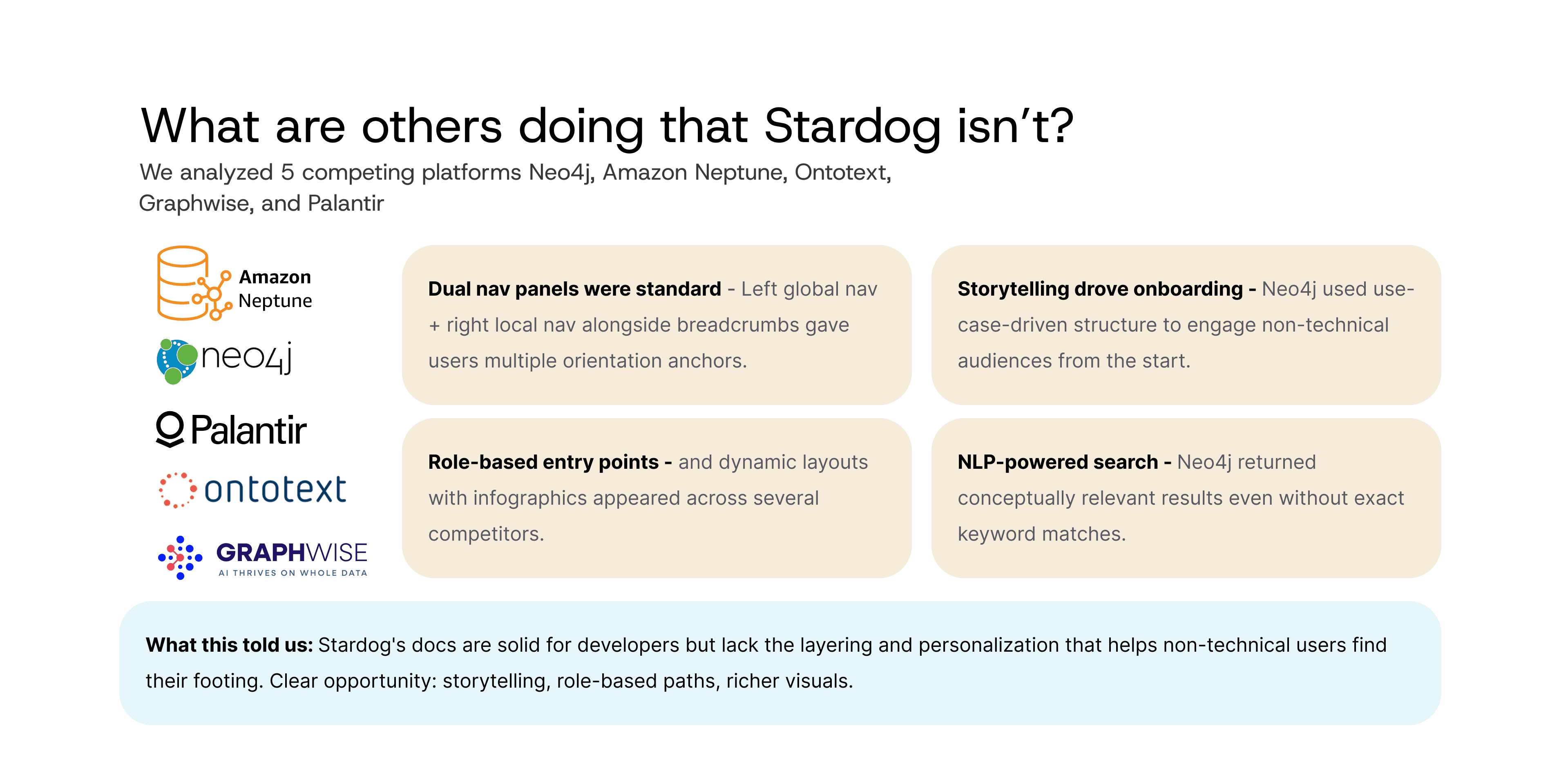
Competitive analysis
SWOT analysis
Affinity mapping
Design
IA restructuring prototype
Navigation prototype
Search functionality prototype
00 THE PROBLEM
Documentation that scaled with the org, not the user
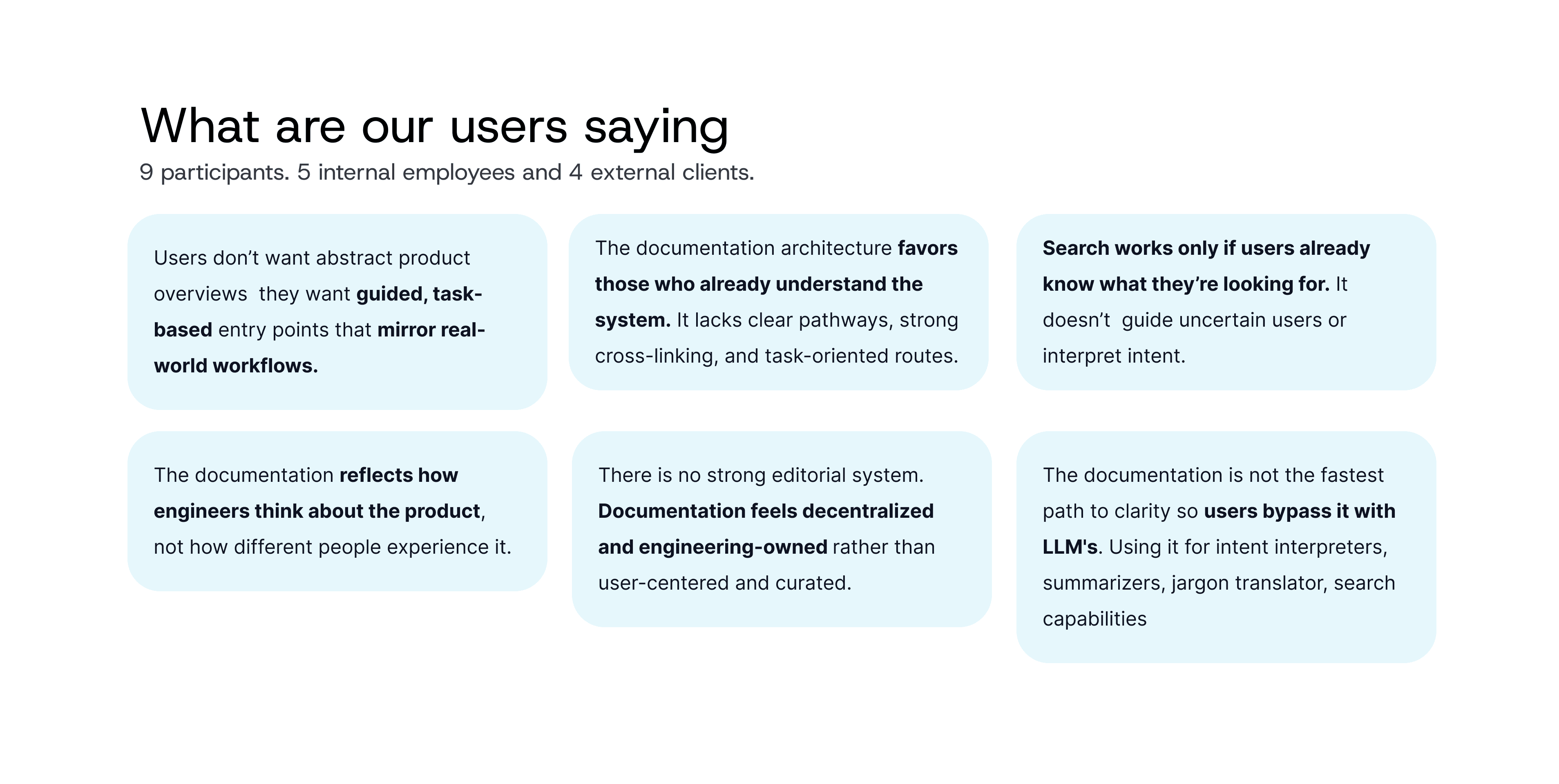
As Stardog grew, docs were added ad hoc and organized by internal product structure. The result is thorough, but it assumes you already know where things live. Internal employees, business stakeholders, and external clients all struggled with the same pages.
01
Slows learning, content assumes users already know the system
02
Increases support load , half of customers email staff before checking docs
03
Blocks adoption, business users hit walls early, limiting Stardog's reach
Connect CMS Image fields (Image 1–10)
01 RESEARCH
Finding out where the docs broke


02 USER TESTING
Tested and Rebuilt
20 usability sessions across three rounds. Participants spanned business, engineering, and data roles. Each module below shows what we took into testing, what broke, and what shipped.
01 Navigation
Restructured around the order Stardog is actually used, not internal product architecture.
WHAT BROKE
Users couldn't predict what lived inside a category before clicking
3 / 3 failed The accordion still mirrored the old structure, so nesting ran deep and participants counted the clicks. Running two nav systems at once felt tiring rather than efficient
WHAT WE TESTED

What Shipped
Top-level categories now follow install → configure → query → deploy. Selecting one surfaces only its contents in a right-hand panel, with headings and indentation marking hierarchy. The in-page nav stayed for long pages, plus a legend for content markers.
02 Search
Two directions went into testing. Neither won outright, so the shipped design takes the layout from one and the labelling from the other.
DESIGN A - LIST WITH A PREVIEW

Breadcrumbs noticed immediately. They gave topic context the current docs have none of.
Page preview was the decisive advantage, relevance confirmed without leaving search.
DESIGN B - RESULT CARDS

Descriptive tags were wanted. Participants asked to carry them into A's layout.
Cards showed too little to judge relevance, forcing extra clicks and slowing goal-directed users.
BROKE IN BOTH
Every participant missed the content filter without a prompt. Described as disjointed, never reached naturally.
The role filter was consistently misunderstood. Cross-functional users worried it would restrict results rather than refine them.
What Shipped
A's list and preview layout as the foundation, with B's descriptive tags on every result. Role filtering was dropped for a faceted panel across content type, product, task, and technology, working within the constraints of Stardog's keyword-based search API. Tags mirror the filter categories so the filters explain themselves. Breadcrumbs now index at subheading level, so results jump straight to the relevant section.
03 Homepage
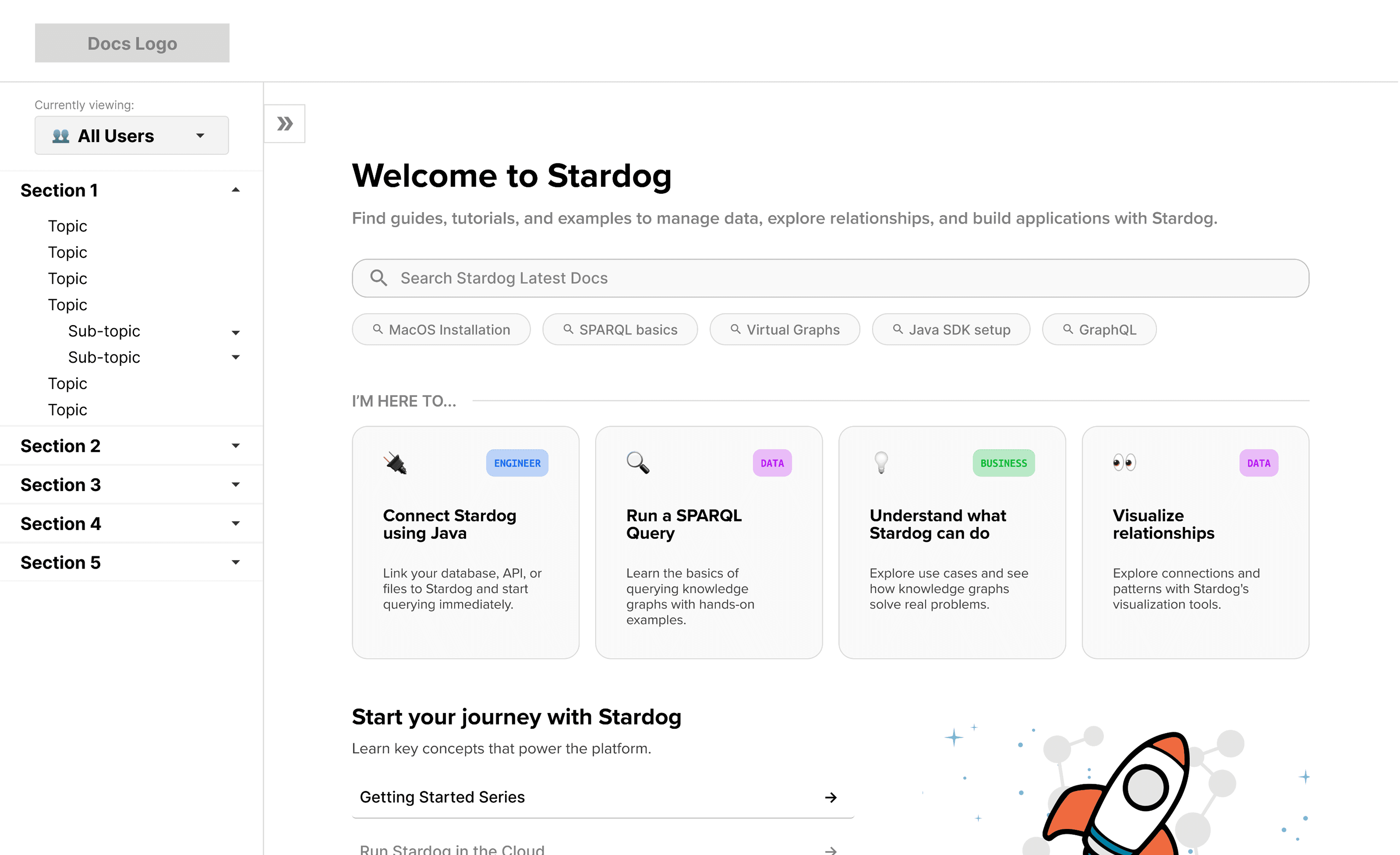
A role selector so business, engineer, data, and new users each get a clear starting point.
WHAT BROKE
Nobody found the role selector. The page's key feature was invisible.
0 / 3 discovered it Weak labelling and nav-bar placement hid it. The task cards were liked in concept but often showed tasks users don't actually do.
WHAT WE TESTED
What Shipped
The selector moved onto the page itself with plain language "I am a…" and role-based tags were replaced with content-type tags. "Start your journey" became task-based links written the way users describe the work, with card content audited per persona.
04 Glossary
Lifted out of buried support content into a top-level item reachable from anywhere in the docs.
WHAT BROKE
Terms didn't look interactive, so most people never found the definitions.
Hover was missed by nearly every participant, leaving terms like SNARL and IRI unexplained mid-task. Code, glossary, and link styling weren't visually distinct from each other, which added to the confusion.
WHAT WE TESTED

What Shipped
Hover-to-define became click-to-expand, which is both more discoverable and more accessible. A legend on content pages explains what each highlight colour means, and every term now lists the other pages it appears on, so the glossary doubles as an index.
03 DESIGN SYSTEM
An end-to-end design system so the docs stay consistent after we leave
Type, colour, spacing, content markers, and every component above, documented for the team maintaining it.

04 IMPACT
Projections
Modelled from usability session task times, the survey, and current support ticket volume.
20–35%
Fewer documentation support tickets, by fixing the findability failure that made users email staff before checking docs
50%+ fewer steps to reach key content, based on the click counts recorded in testing
Role-based entry points for all three user types, reducing first-session drop-off
~40%
Faster time-to-answer for new users, replacing product-first navigation with task-based pathways
30–40% fewer failed search sessions with faceted filters
Search usable by all three segments, not only power users who know the terminology
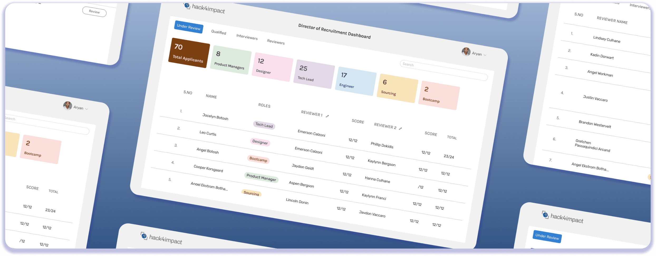
2025 • B2B • Recruitment Tool
Hack4Impact | Internal Tool, Recruitment
500+ applications processed, review cut from 6 steps to 2, 10+ hours saved per cycle for the admin, 33-page form to a 4-step flow
Read Full Story

2026 • Hackathon • Concept Project
FigBuild 2026 | Attune
Visualizing biosignals, a wearable that helps people with anorexia nervosa perceive hunger and fullness.
Read Full Story