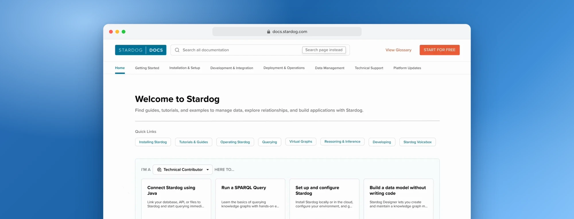
Stardog Documentation System
Restructured Stardog’s documentation around how users actually work replacing product-first organization with clear, task-based pathways.
- Role
- Product Designer
- Timeline
- 10 months
- Tools
- Figma
- Slack
- Team
- 1 PM & Researcher
- 2 Leads
- 1 Engineer
- 4 Designers
Contributions
Research
- User interviews
- Survey co-design
- Usability testing
- Card sorting
Analysis
- IA audit
- Competitive analysis
- SWOT analysis
- Affinity mapping
Design
- IA restructuring prototype
- Navigation prototype
- Search functionality prototype
Impact
- 78%
- Less time to find documentation, from 3 minutes to 40 seconds
- 86%
- Task success rate in moderated usability testing
- 100+
- Customers reached, internal teams and their clients
01 Context
Who Stardog is, and what they came to us with
- The company
- Stardog Inc., an enterprise software company selling a knowledge graph and data fabric platform.
- Who buys it
- Large organizations. Engineering, data, and business teams all end up inside the same product.
- What they asked for
- Their documentation was failing everyone who wasn't already an engineer. Fix it.
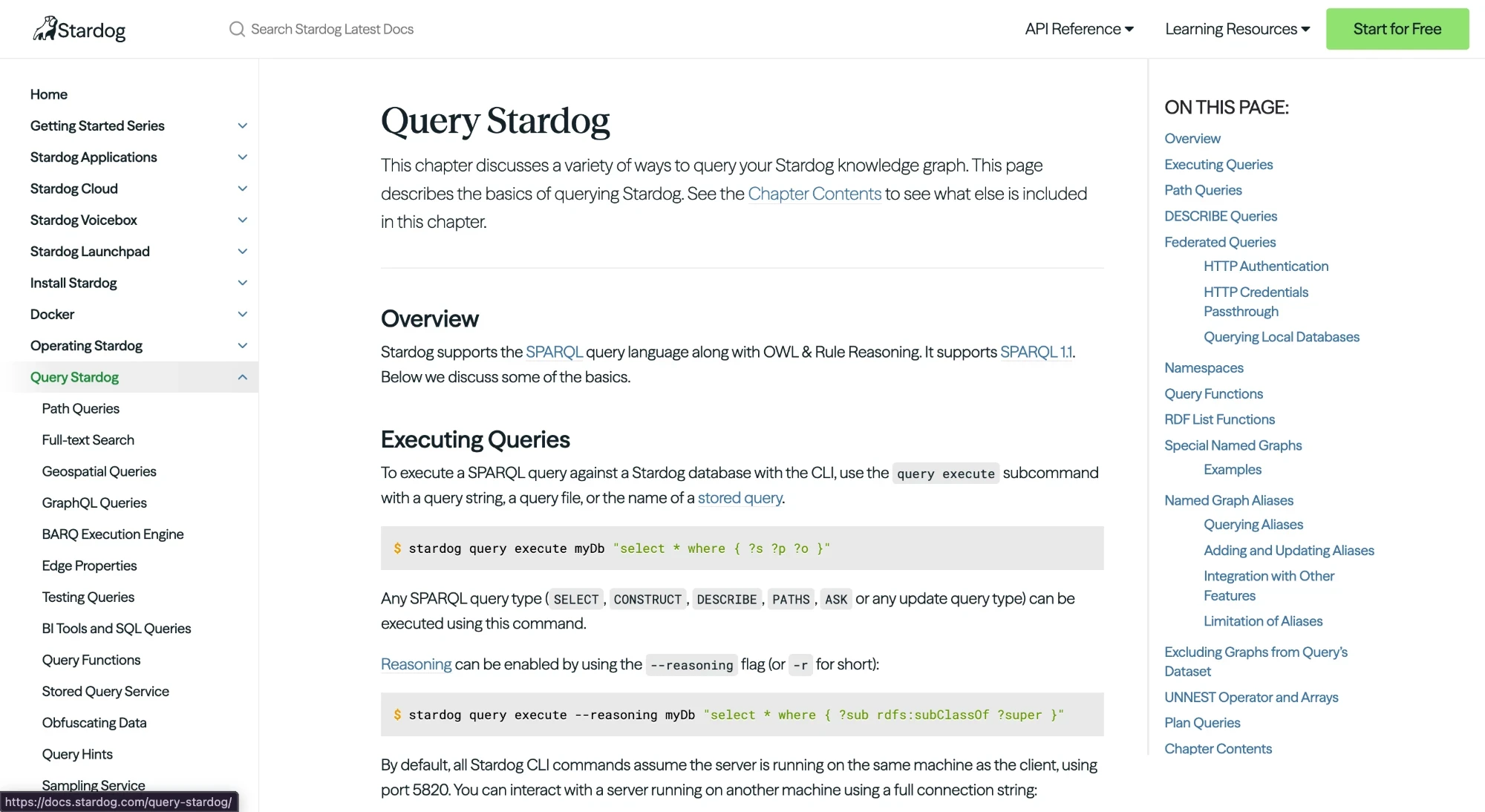
Documentation that scaled with the org, not the user
As Stardog grew, docs were added ad hoc and organized by internal product structure. The result is thorough, but it assumes you already know where things live. Internal employees, business stakeholders, and external clients all struggled with the same pages.
- Slows learning, content assumes users already know the system
- Increases support load, half of customers email staff before checking docs
- Blocks adoption, business users hit walls early, limiting Stardog's reach
02 Research
Finding out where the docs broke
Seven methods, chosen to check each other. Then twenty usability sessions once we had something to test.
What are our users saying
9 participants. 5 internal employees and 4 external clients.
Users don’t want abstract product overviews they want guided, task-based entry points that mirror real-world workflows.
The documentation architecture favors those who already understand the system. It lacks clear pathways, strong cross-linking, and task-oriented routes.
Search works only if users already know what they’re looking for. It doesn’t guide uncertain users or interpret intent.
The documentation reflects how engineers think about the product, not how different people experience it.
There is no strong editorial system. Documentation feels decentralized and engineering-owned rather than user-centered and curated.
The documentation is not the fastest path to clarity so users bypass it with LLM’s. Using it for intent interpreters, summarizers, jargon translator, search capabilities
Inside Stardog, the same friction kept showing up
Responses spanned R&D, Professional Services, Sales, Leadership, and Product, with tenures ranging from 3 to 18 years.
91%
Rely on search as their primary tool
and simultaneously report it returns incomplete or irrelevant results.
45%
Felt lost navigating the sidebar
IA didn’t match users mental models or workflows.
7
Votes for the worst explained section
“Troubleshooting” rated lowest. Quality varied dramatically.
58%
Reported missing examples or tutorials
End to end workflows ranked among top important factors.
2.16/5
Troubleshooting score- was lowest rated
Forces users to Slack coworkers, or generative AI instead of docs.
What are others doing that Stardog isn’t?
We analyzed 5 competing platforms Neo4j, Amazon Neptune, Ontotext, Graphwise, and Palantir
- Amazon Neptune
- Neo4j
- Palantir
- Ontotext
- Graphwise
Dual nav panels were standard - Left global nav + right local nav alongside breadcrumbs gave users multiple orientation anchors.
Storytelling drove onboarding - Neo4j used use-case-driven structure to engage non-technical audiences from the start.
Role-based entry points - and dynamic layouts with infographics appeared across several competitors.
NLP-powered search - Neo4j returned conceptually relevant results even without exact keyword matches.
What this told us: Stardog’s docs are solid for developers but lack the layering and personalization that helps non-technical users find their footing. Clear opportunity: storytelling, role-based paths, richer visuals.
2 Audits, 2 angles on the same problem
We conducted a content audit and a heuristic evaluations
Content audit
16 representative pages reviewed
- Visual hierarchy weak across sections
- Code blocks vary in color and style
- Notes, warnings and tips appear sporadically
- Hyperlinks styled inconsistently
Heuristic evaluation
Against Nielsen’s 10 principles
- Help is hard to find and not contextual
- Inconsistent labeling, icons, and styling
- No support for novice users
- Navigation doesn’t match user mental models
Users sort by how they think, not how we build.
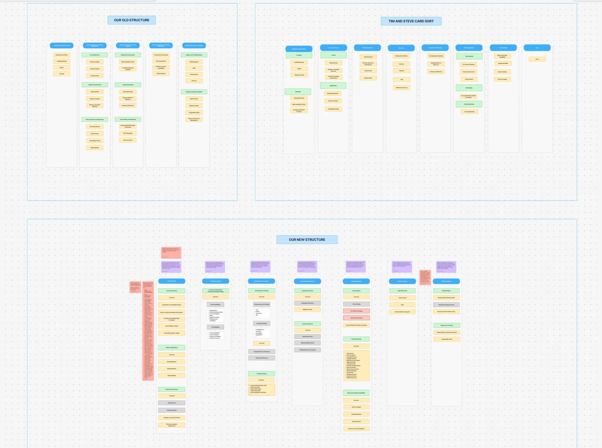
Two rounds of card sorting with 28 documentation sections tested whether Stardog's IA matched real user mental models.
Round 01
Open card sort
4 participants grouped and labelled 28 sections independently. Results analysed using a hybrid LLM + human reasoning approach.
- 4 participants
- 28 cards
Round 02
Negotiated
Same sections re-sorted in pairs to produce one agreed IA
- Pairs
- Negotiated IA
The docs are built around Stardog, not the user
[PLACEHOLDER: one line about the IA audit]
No guided progression
Beginner to advanced scattered, no start-here path
Flat visual hierarchy
Foundational content buried at the same prominence as niche
Inconsistent labels
Terminology varies section to section
No audience separation
Business, admin, and developer content share every section
Pages lack context
No overview, summary, or next steps
Accessibility gaps
Images, GIFs, and videos frequently lack alt text
03 Findings
Three findings, surfaced independently
Seven methods. Three conclusions. The overlap is the argument.
| Interviews | Survey | IA audit | Heuristic | Card sort | Personas | Competitive | |
|---|---|---|---|---|---|---|---|
| Navigation doesn't match how people think | Yes | Yes | Yes | Yes | Yes | Yes | No |
| Search fails the people who need it most | Yes | Yes | No | Yes | No | Yes | No |
| No path for anyone non-technical | Yes | No | Yes | Yes | Yes | Yes | No |
Finding 01
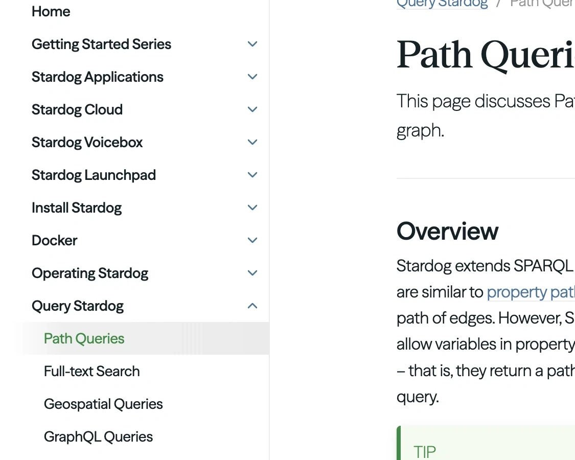
Navigation sections named after products, not what people need to do
- IA audit
- No guided progression, flat hierarchy, and labels that change section to section
- Card sorting
- Users grouped by role, action, or journey. Never by technical architecture
- Survey
- 45% felt lost navigating the sidebar
Finding 02
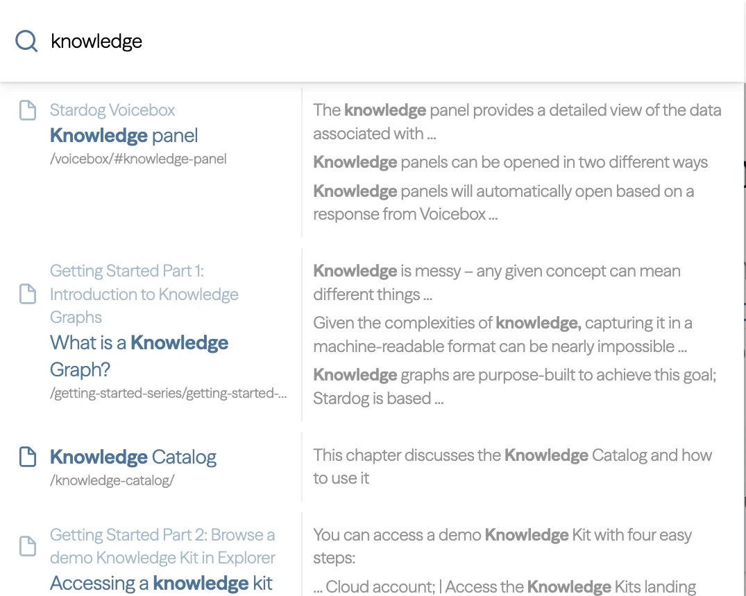
Search matched keywords, not intent
- Survey
- 91% rely on search as their primary tool, and say it returns incomplete results
- Interviews
- It can't interpret intent or guide an uncertain user
- Personas
- Search surfaces high-level overviews when engineers need depth
Finding 03
Written by and for engineers but used by everyone
- Personas
- Engineer deploys it, data engineer builds with it, business user reads the output
- IA audit
- Business, admin, and developer content share every section with no role distinction
- Heuristic evaluation
- No scaffolding of any kind for a first-time or non-technical reader
04 Synthesis · Underneath all three
Nobody owned it, so people routed around it
The cause
There is no editorial system. The documentation is decentralized and engineering-owned rather than curated.
The consequence
Users had started bypassing the docs entirely and asking an LLM instead: for intent, summaries, jargon translation, and search.
Navigation
Built around the product, not the person
Search
The fallback was broken too
Role
No path for anyone non-technical
How might we
Help every kind of Stardog user, technical or not, find what they need without getting stuck?
We needed Stardog's own people to sequence it
Two rounds, 28 documentation sections. First move was to stop guessing at structure.
Why Stardog staff, not outsiders
Ordering a product this technical takes domain knowledge we didn’t have. Their engineers told us what has to come before what: install, configure, query, deploy.
Two card sorts, one solo and one as a group discussion, surfaced three distinct personas and what each does in the docs. That let us group sections by task, not by product.
Then we walked each of them through the docs
Structure alone doesn’t tell you what someone needs when they land. Six personas, three genuinely different relationships with the documentation.
Engineer
Katie Connolly
Installs and deploys Stardog on the client's side and connects their data sources.
- Needs from the docs
- Clearer sections and step-by-step installation instructions.
- Goal
- Install and deploy Stardog on their company's systems.
- Pain
- Scattered resources and unclear installation instructions.
Doesn't need more information. Needs a clear path through installation.
Data engineer
Jenny Brown
Uses the product day to day, building graphs out of the client's data.
- Needs from the docs
- Clearer sections and instructions on how to use Stardog's services.
- Goal
- Build knowledge graphs from their company's data using the Stardog toolkit.
- Pain
- Scattered resources. Hard to follow one product through, or to troubleshoot when a graph won't come together.
Doesn't struggle with complexity. Struggles to find one clear route from data to graph.
Business user
Marcus Bennett
Sales or PM. Decides what gets built and has to read the output.
- Needs from the docs
- Less jargon, clear explanations of the terms that remain, and language everyone can understand.
- Goal
- Use insights from knowledge graphs and present findings to stakeholders.
- Pain
- Too much jargon and scattered information.
Doesn't need to understand the system. Needs plain language.
05 User testing
Tested and Rebuilt
20 usability sessions across three rounds. Participants spanned business, engineering, and data roles. Each module below shows what we took into testing, what broke, and what shipped.
01 Navigation
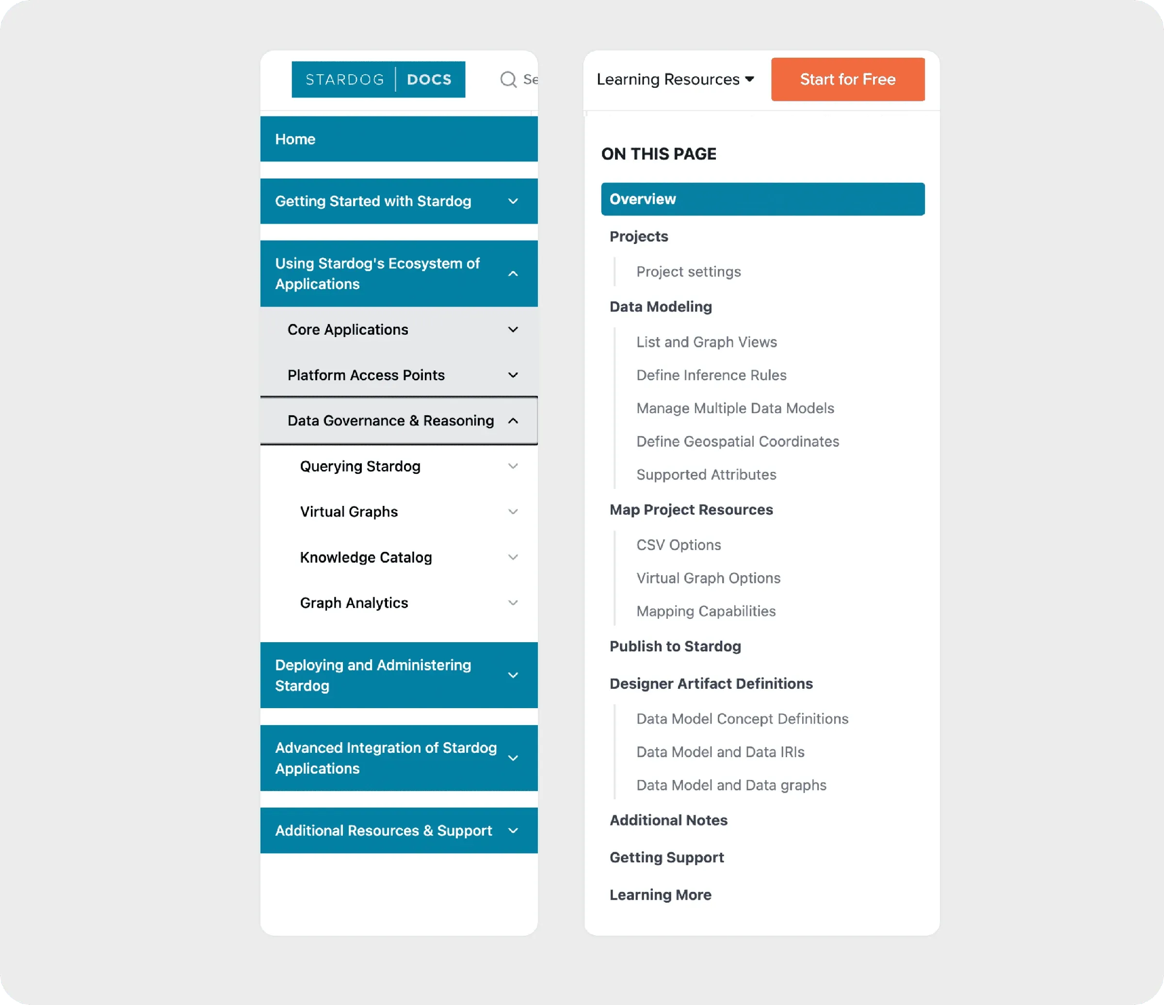
Restructured around the order Stardog is actually used, not internal product architecture.
What broke
Users couldn't predict what lived inside a category before clicking
The accordion still mirrored the old structure, so nesting ran deep and participants counted the clicks. Running two nav systems at once felt tiring rather than efficient
What we tested
What shipped
The top navigation frames the task first, then opens only the relevant sections in the sidebar, reducing cognitive load.
Top-level categories now follow install → configure → query → deploy. Selecting one surfaces only its contents in a right-hand panel, with headings and indentation marking hierarchy. The in-page nav stayed for long pages, plus a legend for content markers.
02 Search
Two directions went into testing. Neither won outright, so the shipped design takes the layout from one and the labelling from the other.
What broke
Keyword search wasn't surfacing the most relevant results.
We explored two approaches to fix it through A/B testing.
Design A - List with a preview
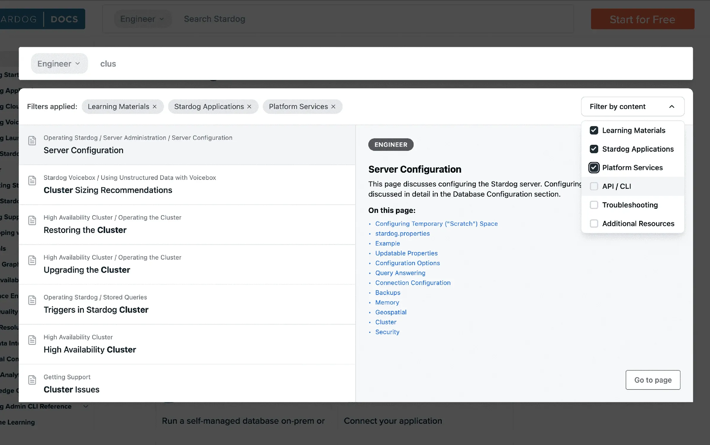
- Breadcrumbs noticed immediately. They gave topic context the current docs have none of.
- Page preview was the decisive advantage, relevance confirmed without leaving search.
Design B - Result cards
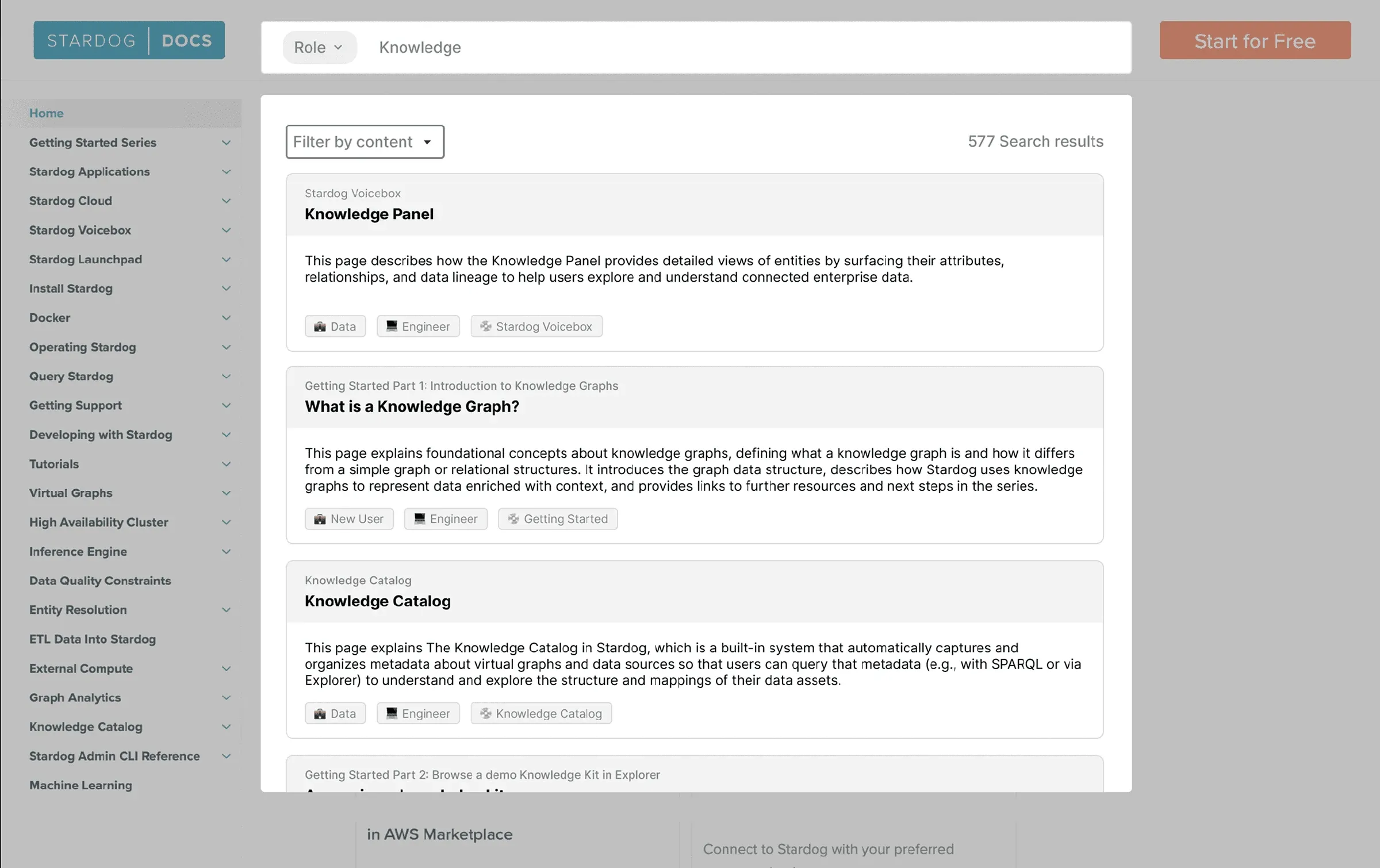
- Descriptive tags were wanted. Participants asked to carry them into A’s layout.
- Cards showed too little to judge relevance, forcing extra clicks and slowing goal-directed users.
Broke in both
- Every participant missed the content filter without a prompt. Described as disjointed, never reached naturally.
- The role filter was consistently misunderstood. Cross-functional users worried it would restrict results rather than refine them.
What shipped
Richer results with filters to narrow them down, and page tags that help keyword search return what's relevant.
A’s list and preview layout as the foundation, with B’s descriptive tags on every result. Role filtering was dropped for a faceted panel across content type, product, task, and technology, working within the constraints of Stardog’s keyword-based search API. Tags mirror the filter categories so the filters explain themselves. Breadcrumbs now index at subheading level, so results jump straight to the relevant section.
03 Homepage
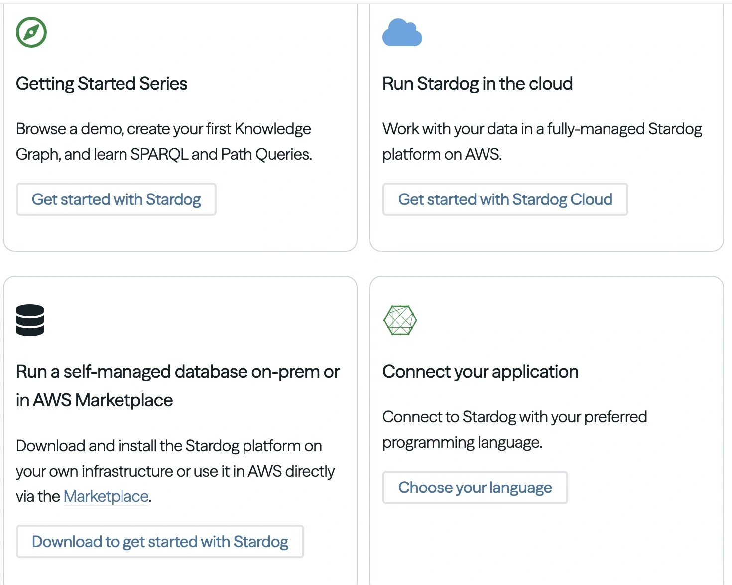
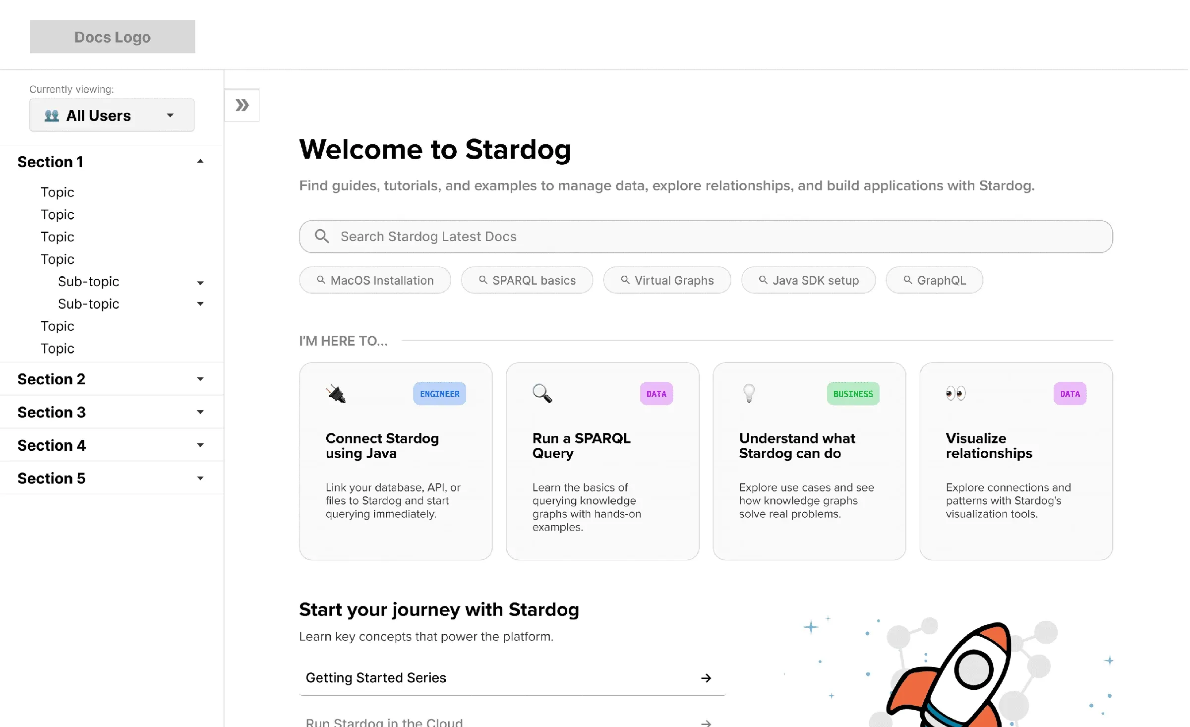
A role selector so business, engineer, data, and new users each get a clear starting point.
What broke
Where it was placed, nobody noticed the role selector.
Weak labelling and nav-bar placement hid it. The task cards were liked in concept but often showed tasks users don’t actually do.
What we tested
What shipped
A centred role selector, paired with the tasks most relevant to each role for faster access.
The selector moved onto the page itself with plain language “I am a…” and role-based tags were replaced with content-type tags. “Start your journey” became task-based links written the way users describe the work, with card content audited per persona.
04 Glossary
Lifted out of buried support content into a top-level item reachable from anywhere in the docs.
What broke
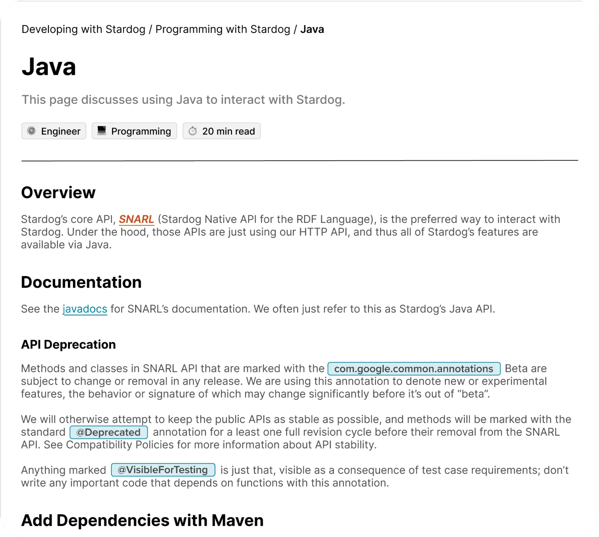
Terms didn't look interactive, so most people never found the definitions.
Hover was missed by nearly every participant, leaving terms like SNARL and IRI unexplained mid-task. Code, glossary, and link styling weren’t visually distinct from each other, which added to the confusion.
What we tested
What shipped
Click-to-expand, a legend for highlight styles, and backlinks to every page a term appears on.
Hover-to-define became click-to-expand, which is both more discoverable and more accessible. A legend on content pages explains what each highlight colour means, and every term now lists the other pages it appears on, so the glossary doubles as an index.
06 Design system
An end-to-end design system so the docs stay consistent after we leave
Type, colour, spacing, content markers, and every component above, documented for the team maintaining it.

07 What's next
What we handed them to do next
Instrument the docs
Connect analytics. Stardog has no visibility into page views or drop-off.
Give the docs an owner
The root cause is editorial, not visual. Someone has to curate it.
Extend search with AI
Layer their existing Voicebox feature in for natural-language queries.
Explore bookmarking
Came up repeatedly in research. Deferred for budget, solvable with a tool.
Revisit Getting Started
Flagged as most in need of a content sprint, not just restructuring.
Refine the tag legend
Align categories to the content types actually present once tagging is live.
08 Reflection
Reflection
01
Talk to every department
02
Set up the design system first
03